The palette
Paint scheme ideas that photograph well
The schemes that look best on the shelf and best in a print share one trait: a confident two-colour identity plus one metallic or bone accent. Here's how to build one, and which combinations flatter a photograph.
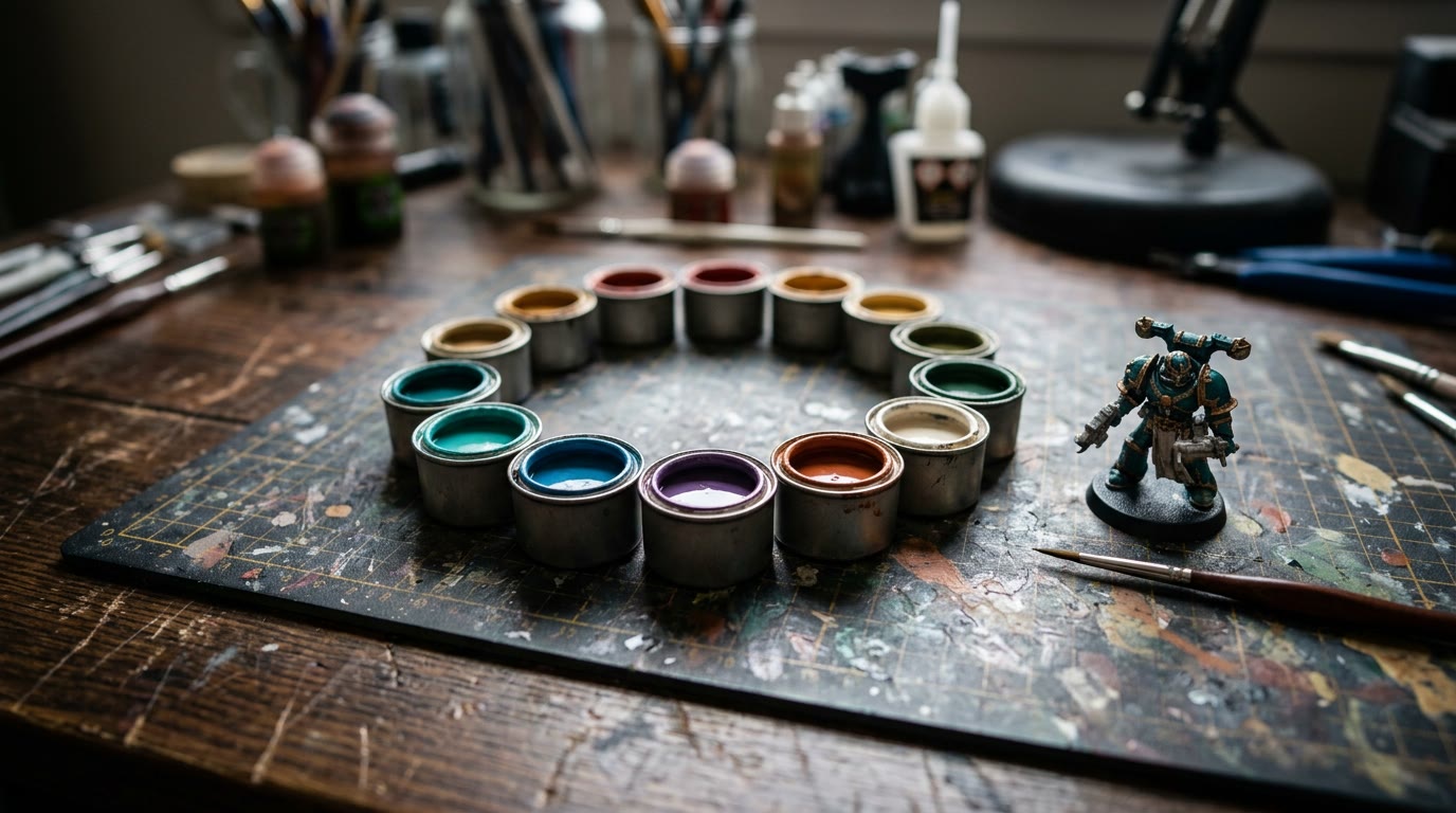
A great paint scheme is a promise kept everywhere: armour, cloth, base, and the photo of the finished model. The schemes that survive all four are usually simple at heart — one dominant colour, one supporting colour, one accent. Complexity lives in the blending, not the palette.
What makes a paint scheme look good?
Contrast in value, not just hue. The eye reads light-versus-dark before it reads blue-versus-red, which is why "bright armour, dark cloth, pale bone details" works on nearly every sculpt. Schemes fail when everything sits in the same mid-tone: beautifully blended, hopelessly flat at two metres.
Then add one departure — a spot colour that appears exactly twice (a lens, a blade edge, a banner). Restraint is what makes it read as a uniform rather than a rainbow.
Six schemes that earn their keep
- Teal and brass on warm bone — the scheme our whole studio was built around. Cold armour, warm metal, cream ground: it flatters every skin tone and prints gloriously against dark or light.
- Rust orange and gunmetal — industrial and forgiving; weathering hides a hundred sins and the orange carries an outdoor photo on its own.
- Deep green, black and gold trim — classic for a reason. Keep the gold to trim only and the scheme stays menacing rather than shiny.
- Bone white, red and washed steel — the high-contrast "military saint" look. Harder to paint (white shows everything) but unbeatable in a bright photo.
- Violet and cold grey — the scheme nobody else at the table has. Photographs slightly cool, which suits moody backdrops and dark walls.
- Sand, brown and a single bright shield — the desert veteran. The neutral mass makes the one bright colour do all the talking.
How do I pick a scheme for my army?
Start from the photo, not the pot. Lay the colours you are considering on a plain card and photograph them under your painting lamp — the camera tells the truth about harmony that the eye negotiates away. Look at the result next to your display shelf's backdrop colour, because scheme and environment share a frame. The tabletop scene's best-looking armies are almost always the ones whose colours were chosen once, written down, and applied with discipline across every model.
Write the recipe down properly: prime, base colours, shade, highlights, basing. Future-you in month ten, painting reinforcement number twelve, will send thanks.
Which schemes photograph best for prints?
Schemes with a mid-tone dominant and a pale accent photograph most forgivingly — the camera keeps both ends of the contrast. Very dark schemes need raking side light to read; very pale schemes need clean white balance or they drift cream. The full lighting method lives in our photography guide, and the backdrop choice interacts with the scheme too — the three rigs each flatter different palettes.
The honest test is the free preview: upload the finished photo to the studio and see the scheme as a framed print on a wall. Painters tell us the preview regularly settles the "is it actually finished?" question the shelf never could.
From the workbench
Questions, answered
How many colours should a paint scheme have?
+
One dominant, one supporting, one accent used twice. Extra colours go into blending, not the palette list.
Which colours photograph best on miniatures?
+
Mid-tone dominants with pale accents — teal and brass, rust and gunmetal, bone and red. Very dark or very pale schemes need more careful lighting.
How do I keep an army scheme consistent?
+
Write the recipe down (prime, bases, shade, highlights, basing) and photograph your reference model under your painting lamp. Match against the photo, not your memory.
Can I preview how a scheme will look as a print?
+
Yes — photograph the finished model and use the free preview in our studio. It renders as a framed print before you pay anything.